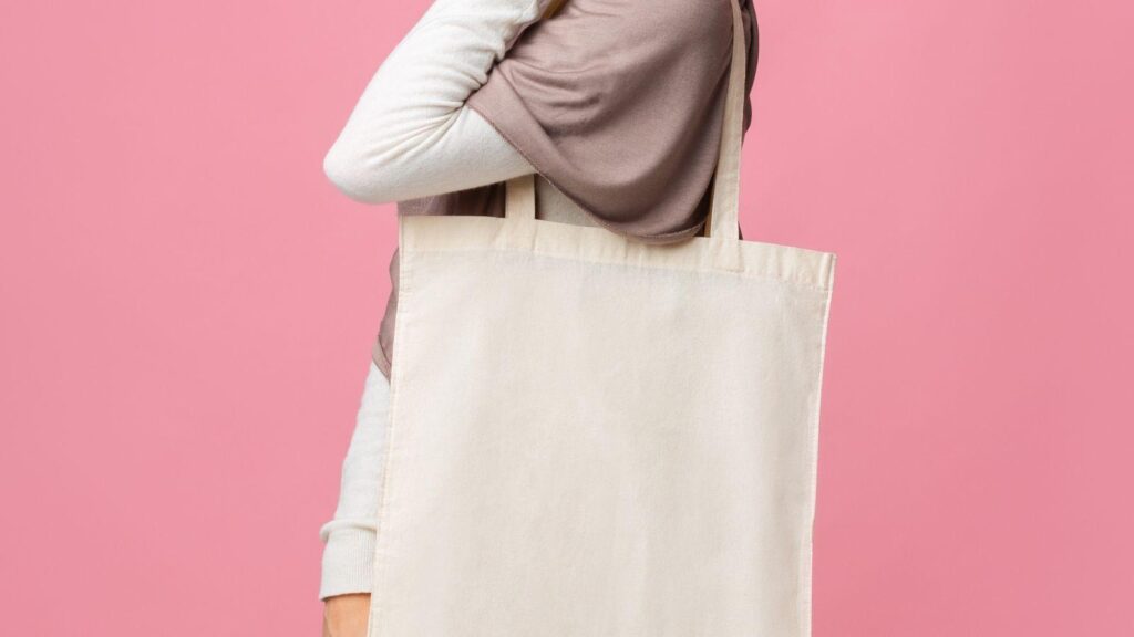
Custom tote bags continue to serve as practical brand touchpoints—used for events, retail merchandise, internal campaigns, nonprofit outreach, and promotional distribution. Unlike digital graphics, however, tote designs must hold up in physical space: on textured fabric, at arm’s length, under varied lighting conditions.
The difference between a casual layout and a professional-looking tote often comes down to structure. Tote bag mockup design tools allow designers to preview scale, spacing, color contrast, and visual balance before sending artwork to print. Rather than guessing how a design will translate onto canvas, these tools simulate real-world placement and proportion.
An accessible starting point for many users is the free online bag design from Adobe Express, which provides editable templates and export-ready files. Used thoughtfully, tools in this category help reduce printing surprises while improving overall polish.
The workflow below focuses on decisions, checkpoints, and refinements that support professional results—regardless of experience level.
Step-by-Step Guide for Using Tote Bag Mockup Design Tools
Step 1: Define the Objective and Select a Structured Template
Goal
Clarify the tote’s purpose and anchor the design to a layout that supports that objective.
How to do it
- Identify the tote’s primary use (event giveaway, retail item, employee kit, etc.).
- Define the audience and tone (corporate, playful, minimalist, activist, educational).
- Browse templates inside a mockup tool and filter by aesthetic style.
- Choose a layout that aligns with your use case instead of defaulting to blank canvas.
- Keep initial structure simple: one focal element and one supporting element.
What to watch for
- Templates that feel overly decorative once your logo or message is inserted.
- Design styles that conflict with audience expectations.
- Layouts built for square graphics that distort on tall tote proportions.
Tool notes
If you prefer drafting raw vector artwork first, Affinity Designer can be used to build scalable logo compositions before importing into a mockup tool.
Step 2: Set Dimensions, Margins, and Print Boundaries
Goal
Prevent cropping, distortion, or edge crowding in final production.
How to do it
- Confirm the exact printable area from your manufacturer.
- Set the canvas to match those measurements.
- Establish a safe zone at least 0.5 inches from edges.
- Center your primary element visually—not just mathematically.
- Lock guides if your tool supports alignment constraints.
What to watch for
- Text drifting too close to seams.
- Uneven top and bottom margins.
- Raster images enlarged beyond their native resolution.
Tool notes
Dimension verification is often clearer inside a print layout tool such as Scribus, where exact measurement controls can help validate margin safety before exporting.
Step 3: Build Visual Hierarchy and Focal Clarity
Goal
Ensure the design communicates clearly within seconds of viewing.
How to do it
- Place the primary message or logo first.
- Add secondary supporting text below or around it.
- Limit font combinations to two or three.
- Increase contrast between headline and background.
- Preview at reduced zoom to simulate distance viewing.
What to watch for
- Competing headline sizes.
- Excessive decorative fonts.
- Misaligned icons or uneven spacing.
Tool notes
For refining type balance, you may export text into Figma for micro-adjustments to letter spacing and layout alignment before reapplying it in your mockup tool.
Step 4: Evaluate Color and Material Interaction
Goal
Confirm that the design remains legible and visually balanced when printed on fabric.
How to do it
- Test your artwork against multiple tote colors.
- Increase contrast if using natural canvas tones.
- Avoid overly thin strokes that may break on textured fabric.
- Convert artwork to a print-friendly color profile if required.
- Compare screen mockup against physical swatches when possible.
What to watch for
- Light pastel text on beige canvas.
- Neon tones that may shift in print.
- Extremely dark inks absorbing into cotton weave.
Tool notes
If color accuracy is critical, validate your palette in a print-calibrated environment such as GIMP, where you can simulate different output profiles before exporting.
Step 5: Use Realistic Mockups to Test Scale and Placement
Goal
Assess proportion and realism before final export.
How to do it
- Apply artwork to a flat-lay mockup.
- Switch to a lifestyle mockup for contextual scale.
- Compare centered vs. slightly elevated placement.
- Adjust scaling so the design fills the space confidently.
- Check how the bag looks when partially folded or wrinkled.
What to watch for
- Artwork appearing smaller than expected.
- Overcrowding when scaled up.
- Perspective distortion in angled mockups.
Tool notes
If your primary tool offers limited mockup realism, you can place exported artwork into a presentation layout tool like VistaCreate’s mockup environment strictly for proportion testing, then return to your primary file for export.
Step 6: Refine Micro-Details and Production Readiness
Goal
Polish fine elements that elevate the design from draft to finished product.
How to do it
- Check kerning and line spacing manually.
- Increase stroke weight on thin lettering.
- Remove unnecessary flourishes.
- Verify spelling and brand consistency.
- Confirm visual balance across the full canvas.
What to watch for
- Decorative lines thinner than 1pt.
- Inconsistent baseline alignment.
- Subtle spacing imbalances around logos.
Tool notes
For advanced typography refinements, Inkscape allows vector-level precision before re-exporting the final artwork into your tote bag mockup tool.
Step 7: Export, Prepare, and Coordinate Fulfillment
Goal
Deliver production-ready files and align with logistics systems.
How to do it
- Export at 300 DPI resolution.
- Use printer-required file formats (PDF, PNG, or SVG).
- Convert text to outlines if necessary.
- Label files with clear version control.
- Coordinate shipment tracking and distribution timelines.
What to watch for
- Exporting at screen resolution.
- Forgetting bleed or safety margins.
- File naming inconsistencies during revisions.
Tool notes
For shipping and distribution coordination after production, ShipStation can be used to manage fulfillment workflows without altering your design file.
Common Workflow Variations
Minimal Logo-Only Tote
Prioritize whitespace and centered branding. Keep typography restrained and scale slightly larger than expected.
Event-Specific Graphic
Use bold, high-contrast type and include date or location details. Test visibility from several feet away.
Small Retail Batch
Align tote aesthetics with your broader product photography style. Mock up in consistent lighting scenarios.
Illustrated Statement Piece
If using custom art, simplify background complexity and test scaling to avoid visual density overload.
Before You Start Checklist
Pre-Export / Pre-Order Checklist
Common Issues and Fixes
The Print Looks Smaller Than Expected
Increase artwork scale slightly within safe margins and re-preview using realistic mockups.
Colors Appear Muted
Adjust saturation modestly and consult your printer’s color profile guidelines.
Text Appears Thin on Fabric
Increase stroke thickness and avoid ultra-light font weights.
Edges Look Cropped
Reconfirm safe area boundaries and reposition key elements further inward.
How To Use Tote Bag Mockup Design Tools: FAQs
Is it better to design directly in a mockup tool or in a vector editor first?
For simple layouts, working directly in a mockup tool can be efficient. For detailed illustrations or complex logos, vector drafting first is often safer.
How many colors should a tote design use?
Fewer colors generally translate more cleanly in screen printing. Detailed color gradients may require digital printing.
Do mockups replace physical proofs?
Mockups help evaluate composition and proportion, but physical proofs remain valuable when color accuracy is critical.
What is the most common design mistake?
Placing text too close to edges or choosing low-contrast color combinations.